Two Individual Data Visualizations
Ming Jin Yong - ACAD274 Designing Interactive Data Structures
This project brings together two data sources: Stanford's SEDA county-level test-score metrics (by subject, grade, and demographic group) and the FCC's Form 477 broadband deployment figures.
The goal is to explore how variations in fixed broadband availability correlate with student performance trends across gender, race/ethnicity, and socioeconomic status at the country level.
Visualization 1: Consumer Fixed Broadband vs. Mean Score (Economically Disadvantaged)
This visualization displays a scatter plot correlating the number of Consumer Fixed Broadband Connections per County (x-axis) with the Mean Academic Score for Economically Disadvantaged Students (y-axis). Each point represents a specific data entry (e.g., a county in a specific year/subject). A linear regression line (yellow) is overlaid to indicate the general trend.
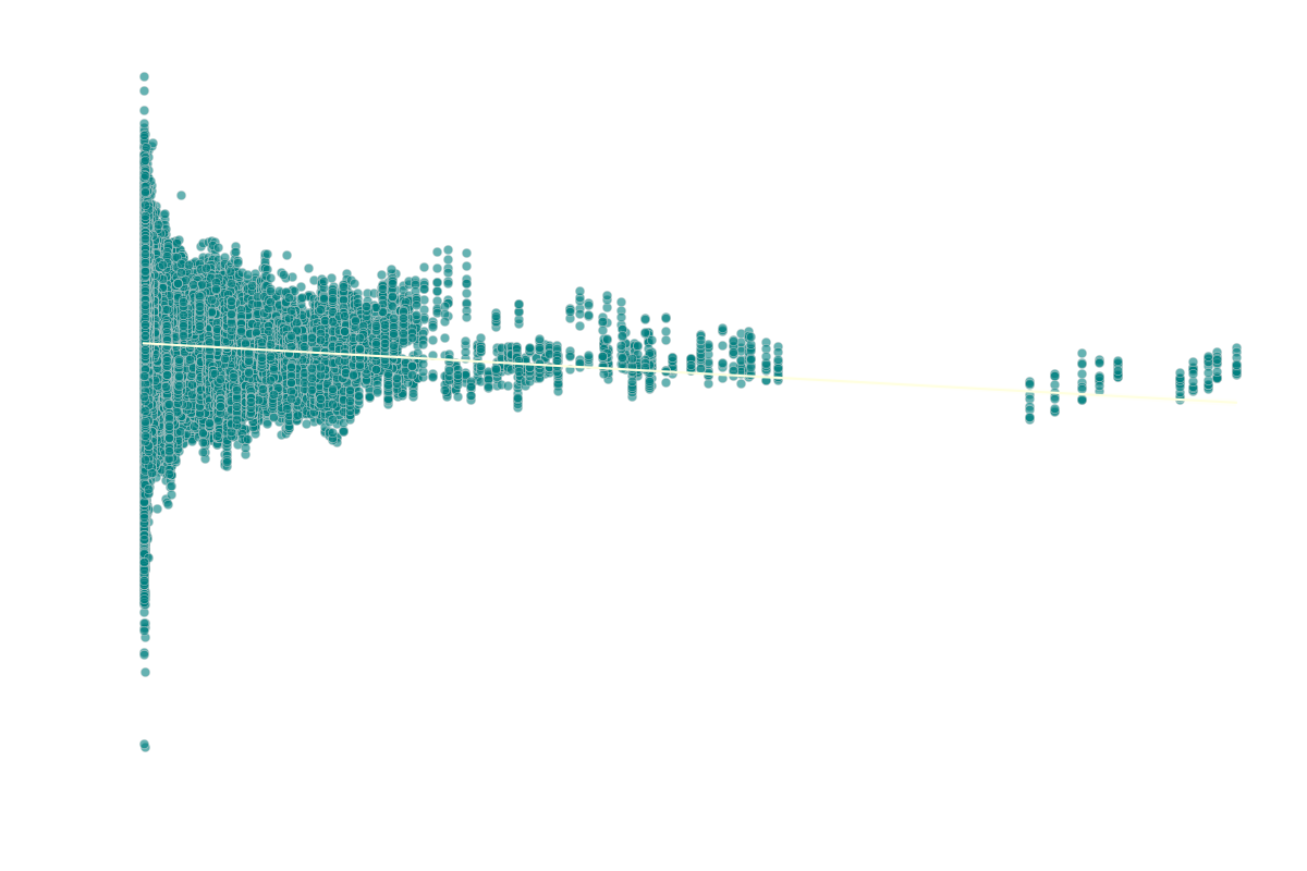
Analysis: The plot reveals a weak positive correlation between the number of consumer fixed broadband connections per county and the mean test scores of economically disadvantaged students, indicated by the slightly upward-sloping trendline. While counties with more connections tend to show slightly higher average scores for this group, the effect is minimal. The most prominent feature remains the high variance in performance scores, particularly in counties with fewer connections (left side of the plot). This suggests that while connectivity might play a minor role, other factors—such as socioeconomic conditions, school funding, and local resources—are significantly more influential on the academic outcomes of economically disadvantaged students.
Visualization 2: Average Student Scores Over Time (Overall vs. Economically Disadvantaged)
This line chart tracks the average standardized test scores for two student groups—all students (beige line) and economically disadvantaged students (cyan line)—from 2009 to 2019 across all counties, subjects, and grade levels included in the dataset. The y-axis represents the mean score relative to a baseline (standardized scores often center around 0).
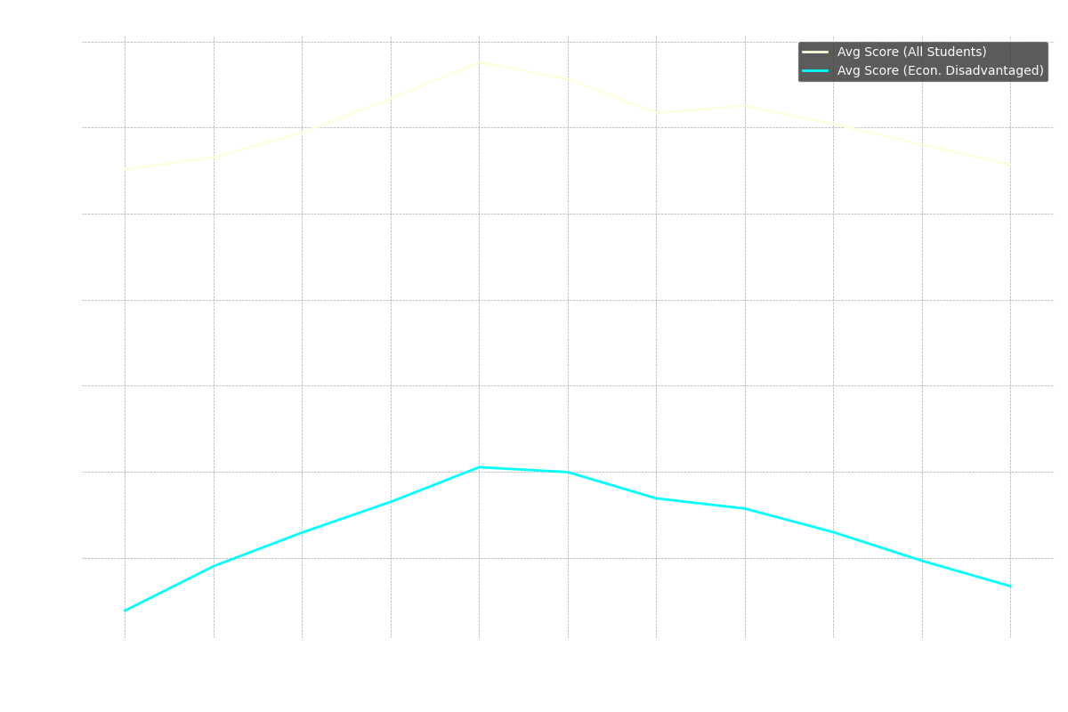
Analysis: The visualization highlights a persistent achievement gap between economically disadvantaged students and the overall student population throughout the decade. Both groups experienced a slight increase in average scores peaking around 2013-2014, followed by a gradual decline. Notably, the decline appears slightly more pronounced for economically disadvantaged students in the latter half of the period. While the scores fluctuated, the gap remained relatively consistent, suggesting systemic factors beyond just year-to-year variations influencing the performance disparity. This trend underscores the ongoing challenges faced by economically disadvantaged students in achieving academic parity.
Data Table
This section displays the underlying data used for the visualizations, broken down into relevant categories.
County & Connectivity Information
| state_fips_code | state_name | state_abbrev | county_fips_code | county_name | year | connections_consumer_fixed | connections_non_consumer_fixed | connections_total_fixed |
|---|---|---|---|---|---|---|---|---|
| ... | ... | ... | ... | ... | ... | ... | ... | ... |
| ... | ... | ... | ... | ... | ... | ... | ... | ... |
Overall Performance
| county_fips_code | year | subject | grade_level | mean_score_all_students | se_score_all_students | assessments_count_all_students |
|---|---|---|---|---|---|---|
| ... | ... | ... | ... | ... | ... | ... |
| ... | ... | ... | ... | ... | ... | ... |
Performance by Gender
| county_fips_code | year | subject | grade_level | mean_score_male | se_score_male | assessments_count_male | mean_score_female | se_score_female | assessments_count_female |
|---|---|---|---|---|---|---|---|---|---|
| ... | ... | ... | ... | ... | ... | ... | ... | ... | ... |
| ... | ... | ... | ... | ... | ... | ... | ... | ... | ... |
Performance by Economic Status
| county_fips_code | year | subject | grade_level | mean_score_econ_disadvantaged | se_score_econ_disadvantaged | assessments_count_econ_disadvantaged |
|---|---|---|---|---|---|---|
| ... | ... | ... | ... | ... | ... | ... |
| ... | ... | ... | ... | ... | ... | ... |
Performance by Race/Ethnicity
| county_fips_code | year | subject | grade_level | Multiracial (Mean, SE, Count) | Two+ Races (Mean, SE, Count) | Other Ethnicity (Mean, SE, Count) | Black (Mean, SE, Count) | Hispanic (Mean, SE, Count) | White (Mean, SE, Count) | Asian (Mean, SE, Count) | Native American (Mean, SE, Count) |
|---|---|---|---|---|---|---|---|---|---|---|---|
| ... | ... | ... | ... | ... | ... | ... | ... | ... | ... | ... | ... |
| ... | ... | ... | ... | ... | ... | ... | ... | ... | ... | ... | ... |
Performance by Intersectional Groups
| county_fips_code | year | subject | grade_level | White/Asian (Mean, SE, Count) | White/Black (Mean, SE, Count) | White/Hispanic (Mean, SE, Count) | White/Native (Mean, SE, Count) |
|---|---|---|---|---|---|---|---|
| ... | ... | ... | ... | ... | ... | ... | ... |
| ... | ... | ... | ... | ... | ... | ... | ... |
Data Sources
- Stanford Educational Opportunity Project (SEDA) v5.0 County Level Achievement Data:
https://edopportunity.org/opportunity/data/downloads/#testscore-5 - FCC Form 477 County Data for Internet Access Services:
https://www.fcc.gov/form-477-county-data-internet-access-services