Introduction
This project brings together two data sources: Stanford's SEDA county-level test-score metrics (by subject, grade, and demographic group) and the FCC's Form 477 broadband deployment figures.
The goal is to explore how variations in fixed broadband availability correlate with student performance trends across gender, race/ethnicity, and socioeconomic status at the country level.
Project Purpose
Our project aims to investigate the potential relationship between broadband internet access and educational outcomes across diverse student populations. By analyzing county-level data on both internet availability and standardized test performance, we seek to:
- Identify correlations between internet connectivity metrics and student achievement
- Examine whether these relationships vary across different demographic groups
- Provide evidence-based insights to inform digital equity initiatives in education
- Create interactive tools for stakeholders to explore these relationships
Key Assumptions
Our analysis operates under several important assumptions:
- FCC Form 477 data provides a reasonable proxy for actual broadband availability
- Stanford SEDA test scores represent a valid measure of academic achievement
- County-level aggregation is appropriate for detecting meaningful relationships
- While correlation does not imply causation, strong correlations warrant further investigation
- Digital access inequality may manifest differently across various demographic subgroups
Resources
This page contains links and summaries of key resources used in our research on the relationship between internet connectivity and educational outcomes.
Data Sources
- Stanford Educational Opportunity Project (SEDA) v5.0 County Level Achievement Data - Comprehensive dataset of standardized test scores at the county level, disaggregated by subject, grade level, and demographic groups.
- FCC Form 477 County Data for Internet Access Services - Official data on broadband deployment and internet access services at the county level, collected semi-annually from providers.
Research Studies
- Wei, L., & Hindman, D. B. (2011). Does the Digital Divide Matter More? Comparing the Effects of New Media and Old Media Use on the Education-Based Knowledge Gap - Examines how various types of media use affect knowledge gaps between education groups.
- Hampton, K. N., Fernandez, L., Robertson, C. T., & Bauer, J. M. (2020). Broadband and Student Performance Gaps - Investigates the relationship between home internet access and student performance on standardized tests.
- Vigdor, J. L., Ladd, H. F., & Martinez, E. (2014). Scaling the Digital Divide: Home Computer Technology and Student Achievement - Explores the impact of home computer technology on student achievement using administrative data from North Carolina public schools.
Reports and White Papers
- Pew Research Center (2020). 53% of Americans Say the Internet Has Been Essential During the COVID-19 Outbreak - Survey data highlighting the importance of internet access during the pandemic, particularly for educational purposes.
- Future Ready Schools (2020). The Homework Gap in America - Overview of the "homework gap" phenomenon and its disproportionate impact on rural and low-income students.
- EducationSuperHighway (2022). No Home Left Offline - Comprehensive report on the state of digital equity in American K-12 education with policy recommendations.
Data Visualization Resources
- D3.js - Data-Driven Documents - JavaScript library for creating dynamic, interactive data visualizations in web browsers.
- Seaborn - Python data visualization library based on matplotlib that provides a high-level interface for drawing attractive statistical graphics.
- Matplotlib - Comprehensive library for creating static, animated, and interactive visualizations in Python.
User Research
We chatted with a few students who might use our tools. These are rough notes from our conversations about the prototypes we showed them. Nothing formal - just honest feedback to help us make these tools better.
Clara (Urban Planning Student)
Clara got really excited about the County Map Explorer. She said it reminded her of something she tried to build for a class project once but gave up on because it was too complicated.
"Oh wow, this is cool! I've been trying to visualize this exact stuff for my planning class but all the data was just stuck in these awful spreadsheets."
She kept clicking around the prototype and asking if she could compare counties side by side. "I'd love to put a rural county next to an urban one and just see the difference right there."
When we showed her the Demographic Gap Analyzer, she got quiet for a minute.
"This hits different than just reading numbers, you know? Seeing the gaps visually like that... that's the kind of thing that makes people actually care."
Her main complaint was about the jargon. "What does 'connectivity metric' actually mean here? I get it because I study this stuff, but my mom wouldn't." She thought tooltips or a simple glossary would help a lot.
Jordan (CS Major, Data Viz Enthusiast)
Jordan spent most of his time playing with the filtering dashboard, clicking everything possible. He seemed to enjoy breaking things.
"This is what dashboards should actually DO. Let me mess with stuff and see what happens. Most dashboards are just... boring charts you stare at."
He had a good point about filter feedback though: "I can't really tell when I've changed something sometimes. Like, did the chart update? I think it did?" He suggested some kind of animation when data changes.
His best idea was adding some preset filter combinations - like a "Greatest Gaps" button or "Most Improved Counties" shortcut. "Something for people who don't know what they're looking for yet."
Jordan also kept asking about the mobile version. "Does it work on phones? Because that's where most people will probably look at it."
Maya (Public Policy Grad Student)
Maya was the most thoughtful of the group. She didn't click around as much but asked deeper questions about what we were trying to accomplish.
"I like that this doesn't feel like it's just for data nerds. It feels like something I could show at a community meeting and people would get it."
She was especially interested in the County Map Explorer and Gap Analyzer. "These make the numbers feel human. It's not just statistics, it's about real kids in real places."
Her best feedback was about adding next steps. "So I'm looking at this gap in my county... now what? What do I do with this information?" She suggested adding small prompts like "Share this with your school board" or "See how your county compares to neighbors."
Maya also wanted stories built into the visualizations: "Even just a little note that says 'Notice how rural counties in the south show a different pattern than urban ones' - little breadcrumbs to help people see what matters."
What We Learned
- People connect with visualizations that make abstract numbers feel real
- We need to explain things better - less jargon, more guidance
- Users want to know what to do with the insights they find
- Comparison features are high on everyone's wishlist
- The tools need to work for both data experts and community members
Interactive Visualization Ideas
This page outlines our plans and concepts for interactive data visualizations to be implemented in Milestones 3 and 4.
1. Interactive County Map Explorer
A choropleth map of U.S. counties that allows users to visualize connectivity and performance data geographically.
Key Features:
- Color-coded counties based on either connectivity metrics or performance scores
- Toggle between metrics (total fixed connections, consumer fixed connections, mean scores)
- Filter by year to see how connectivity and performance change over time
- Hover tooltips showing detailed county data
- Zoom functionality to focus on specific regions
Technical Approach: D3.js with GeoJSON data and dynamic data binding
2. Multi-variable Filtering Dashboard
An interactive dashboard that allows users to filter data based on multiple variables and see how different factors interact.
Key Features:
- Dropdown selectors for state, grade level, subject, and year
- Range sliders to filter by connectivity levels or performance scores
- Dynamic updating of charts and tables based on selected filters
- Cross-filtering capability allowing selection in one chart to filter others
- Export functionality for filtered datasets
Technical Approach: Combination of D3.js and HTML form controls with JavaScript event handling
3. Demographic Gap Analyzer
An interactive tool focused on exploring performance gaps between different demographic groups and how these gaps correlate with connectivity metrics.
Key Features:
- Side-by-side comparison of performance for different demographic groups
- Gap visualization showing the difference between groups
- Correlation plots showing how gaps relate to connectivity metrics
- Time series view to track changes in gaps over years
- County ranking table showing best and worst counties for educational equity
Technical Approach: D3.js with custom components and calculated metrics
4. Connectivity Threshold Explorer
A tool to explore potential "threshold effects" where increases in connectivity past certain levels may have diminishing returns on educational outcomes.
Key Features:
- Dynamic binning of counties based on connectivity levels
- Mean performance comparison across connectivity bins
- Adjustable threshold slider to explore different cutoff points
- Statistical significance indicators for differences between groups
- County-level drill-down for detailed analysis
Technical Approach: JavaScript statistical libraries with D3.js visualizations
Implementation Priorities
For Milestone 3, we plan to implement the Interactive County Map Explorer and Multi-variable Filtering Dashboard as our highest priority items. The Demographic Gap Analyzer and Connectivity Threshold Explorer will be considered for Milestone 4 if time and resources permit.
Visualization Set 1: Connectivity and Performance Relationships
Exploring relationships between internet connectivity metrics and student performance scores.
Visualization 1: Total Fixed Connections vs. Mean Score (All Students)
Scatter plot examining the relationship between county internet infrastructure and student performance.
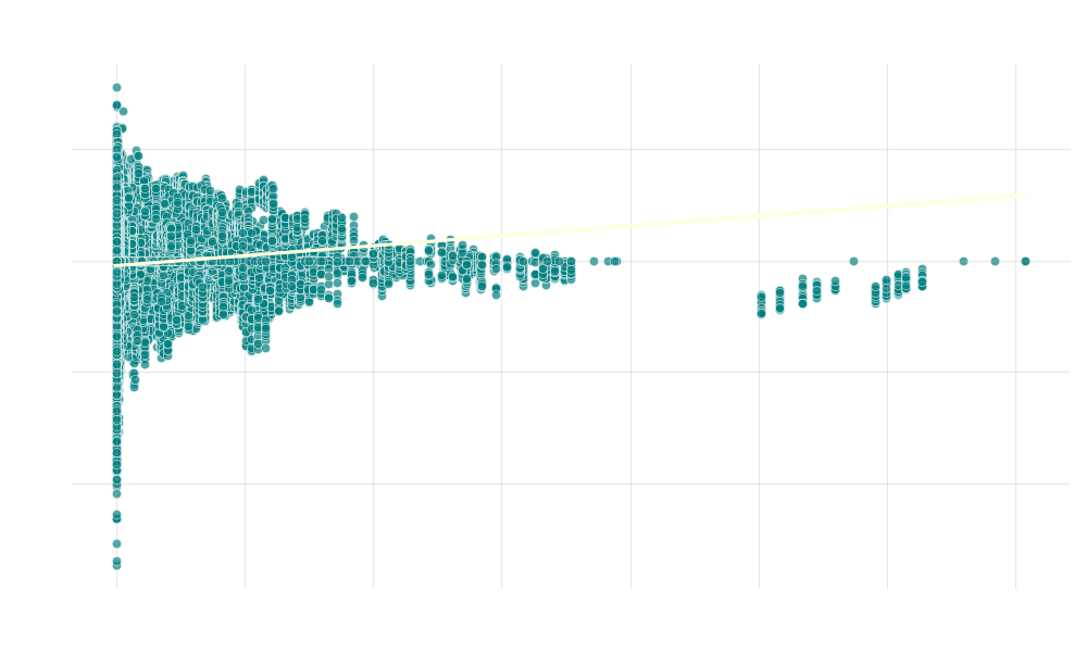
Analysis: Slight positive correlation between fixed connections and student performance. Higher variance in counties with fewer connections suggests connectivity is one of many factors affecting achievement.
Visualization 2: Consumer Fixed Connections vs. Mean Score (Economically Disadvantaged)
Scatter plot showing how home internet access relates to performance of economically disadvantaged students.
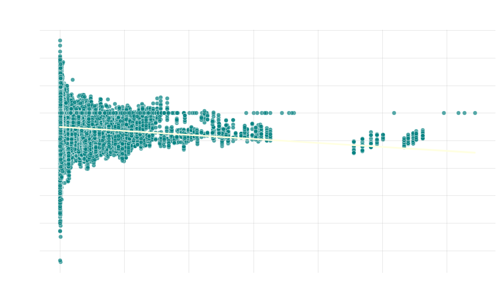
Analysis: Weak positive correlation between home internet access and disadvantaged student performance. Higher score variance in low-connectivity counties indicates socioeconomic factors may overshadow connectivity effects.
Visualization 3: Average Mean Score (All Students) Over Years
Line chart tracking student performance trends over time.
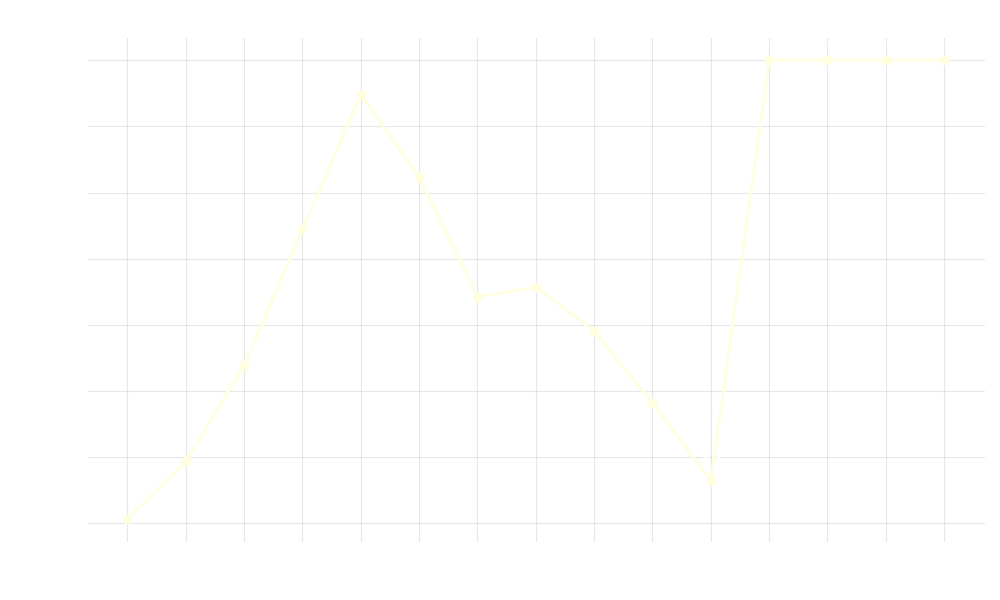
Analysis: Reveals temporal trends in student achievement that may correspond with policy changes, technological advancements, or other period-specific factors affecting education nationwide.
Visualization Set 2: Performance Distribution Analysis
Analyzing student performance across different dimensions.
Visualization 4: Average Mean Score (All Students) by Subject
Bar chart comparing performance across academic subjects.
Analysis: Highlights subject-specific performance variations. Some subjects may show stronger correlations with connectivity than others, particularly those requiring online research or digital resources.
Visualization 5: Distribution of Mean Scores by Grade Level
Box plot showing score distributions across grade levels.
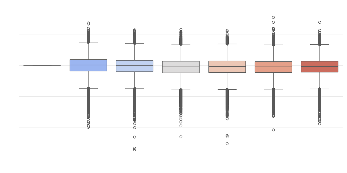
Analysis: Reveals grade-specific performance patterns and identifies educational transition points. Internet connectivity effects may differ by grade level, potentially stronger in higher grades where technology use increases.
Visualization 6: Correlation Matrix of Numeric Columns
Heatmap showing relationships between key metrics.
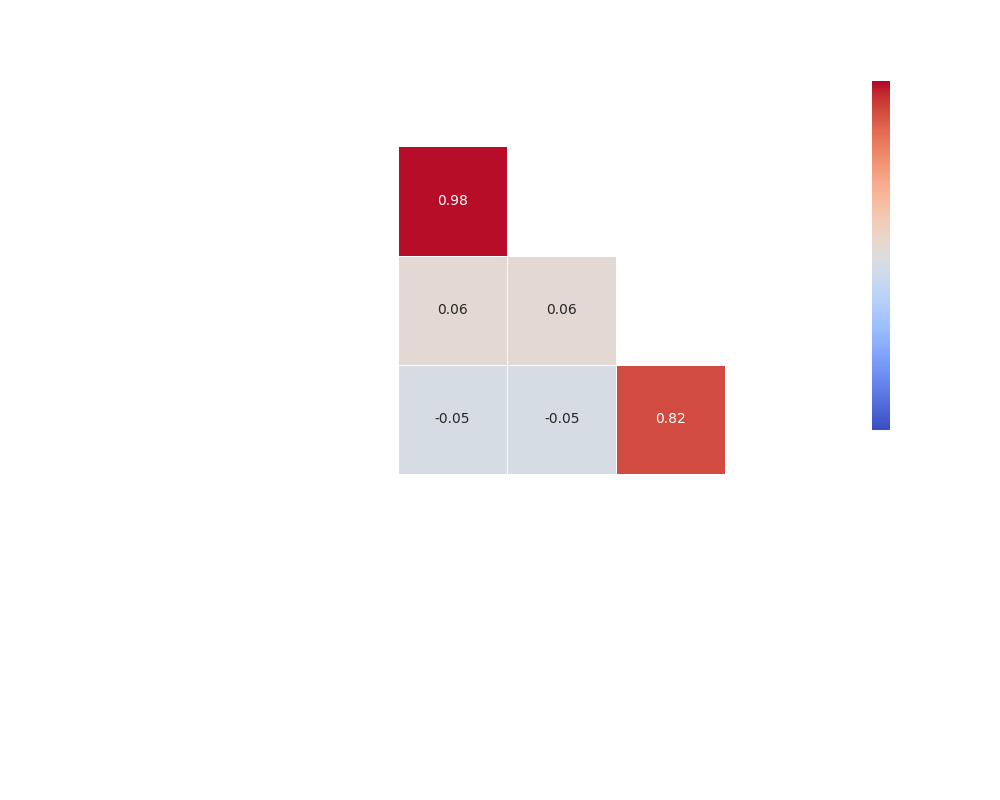
Analysis: Quantifies relationships between connectivity measures and performance metrics. Efficiently identifies which relationships are strongest and highlights unexpected correlations worth investigating.
Visualization Set 3: Advanced Distribution and Relationship Analysis
Exploring complex distributions and relationships in the dataset.
Visualization 7: Distribution of Mean Scores (All Students)
Histogram showing the frequency distribution of student performance scores.
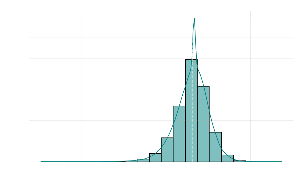
Analysis: Shows overall score distribution shape. Multiple peaks may indicate performance tiers potentially related to different levels of internet infrastructure or other socioeconomic factors.
Visualization 8: Score Distribution by Subject (Violin Plot)
Violin plot showing detailed performance distributions across subjects.
Analysis: Reveals subject-specific score concentration patterns. Bimodal distributions may indicate performance gaps between students with versus without adequate internet access.
Visualization 9: Pairwise Relationships Between Key Variables
Matrix of scatter plots showing relationships between all numeric variables.
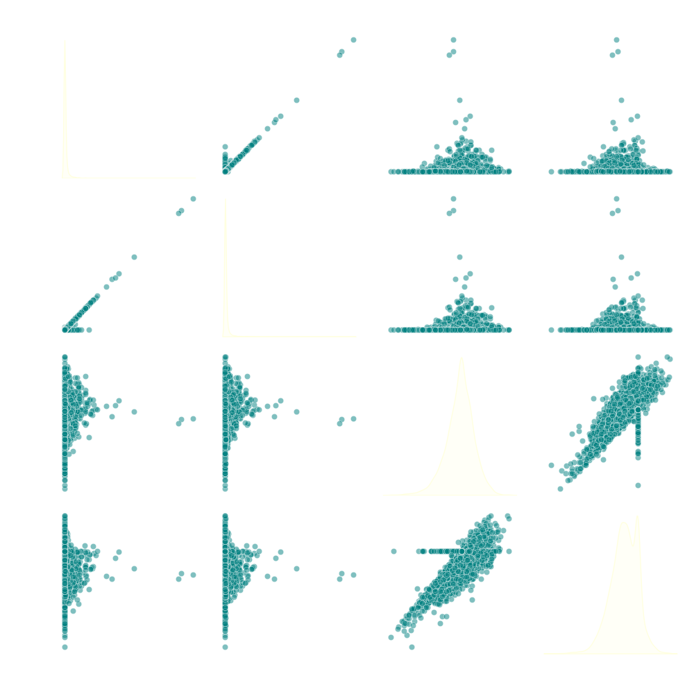
Analysis: Comprehensive view of all variable relationships, revealing which pairs show strong associations, nonlinear patterns, or little correlation. Valuable for discovering unexpected interactions between connectivity metrics and performance indicators.
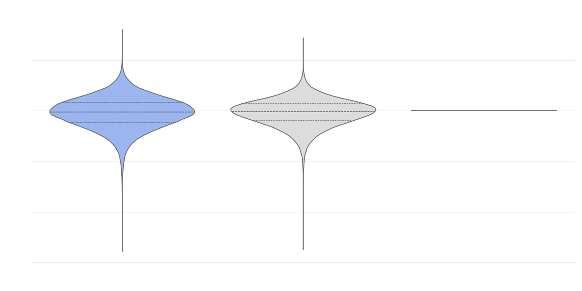
Visualization 10: Distribution of Mean Scores (All Students) by Subject
This violin plot displays the probability density of student performance scores across different academic subjects. Unlike box plots, violin plots show the full distribution shape, revealing nuances in how scores are distributed within each subject.

Analysis: The visualization provides a more detailed view of how performance distributions vary across different subjects than simple averages or box plots allow. The width of each "violin" at different points shows where score concentrations occur within each subject. This helps identify subjects where performance is tightly clustered versus those with wider variability. Subjects showing bimodal distributions (two distinct peaks) might indicate performance gaps between different student populations, potentially including those with versus without adequate internet access. By comparing not just the medians but the entire distribution shapes across subjects, we can better understand subject-specific achievement patterns and identify areas where targeted interventions, including digital resource allocation, might be most beneficial.
Database
This section displays the underlying data used for the visualizations, broken down into relevant categories.
County & Connectivity Information
| state_fips_code | state_name | state_abbrev | county_fips_code | county_name | year | connections_consumer_fixed | connections_non_consumer_fixed | connections_total_fixed |
|---|
Overall Performance
| county_fips_code | year | subject | grade_level | mean_score_all_students | se_score_all_students | assessments_count_all_students |
|---|
Performance by Gender
| county_fips_code | year | subject | grade_level | mean_score_male | se_score_male | assessments_count_male | mean_score_female | se_score_female | assessments_count_female |
|---|
Performance by Economic Status
| county_fips_code | year | subject | grade_level | mean_score_econ_disadvantaged | se_score_econ_disadvantaged | assessments_count_econ_disadvantaged |
|---|
Performance by Race/Ethnicity
| county_fips_code | year | subject | grade_level | Multiracial (Mean, SE, Count) | Two+ Races (Mean, SE, Count) | Other Ethnicity (Mean, SE, Count) | Black (Mean, SE, Count) | Hispanic (Mean, SE, Count) | White (Mean, SE, Count) | Asian (Mean, SE, Count) | Native American (Mean, SE, Count) |
|---|
Performance by Intersectional Groups
| county_fips_code | year | subject | grade_level | White/Asian (Mean, SE, Count) | White/Black (Mean, SE, Count) | White/Hispanic (Mean, SE, Count) | White/Native (Mean, SE, Count) |
|---|
Data Sources
- Stanford Educational Opportunity Project (SEDA) v5.0 County Level Achievement Data:
https://edopportunity.org/opportunity/data/downloads/#testscore-5 - FCC Form 477 County Data for Internet Access Services:
https://www.fcc.gov/form-477-county-data-internet-access-services